Hourly Sales

January 02, 2026
The Hourly Sales report gives you a visualization of your store's daily average sales by the time of day in 15-minute intervals. The Hourly Sales report can be useful for instances like planning appropriate staffing numbers and shifts for busier times. Keep reading to see how to work with this report to get the information you need!
Hourly Sales
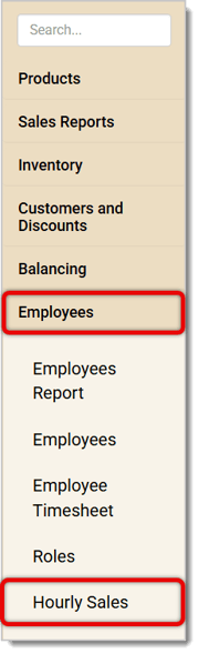
In the IT Retail Back End, go to Employees > Hourly Sales in the main menu.
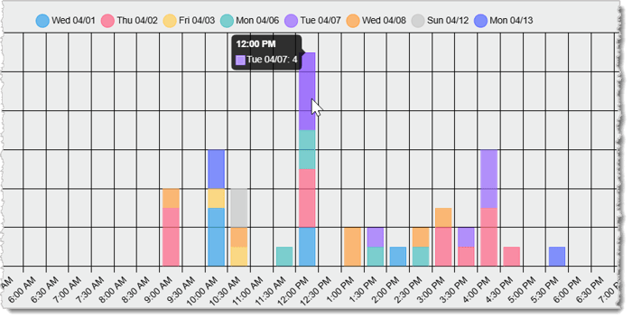
You'll see your data presented as a bar graph. The X-axis (the horizontal line) in this bar graph represents the Time, and the Y-axis (the vertical line) represents the Number of Transactions. Each day will also be color-coded for easier viewing.
On this page, you have multiple filters you can use to narrow down your data. Here's everything you can do in this report:
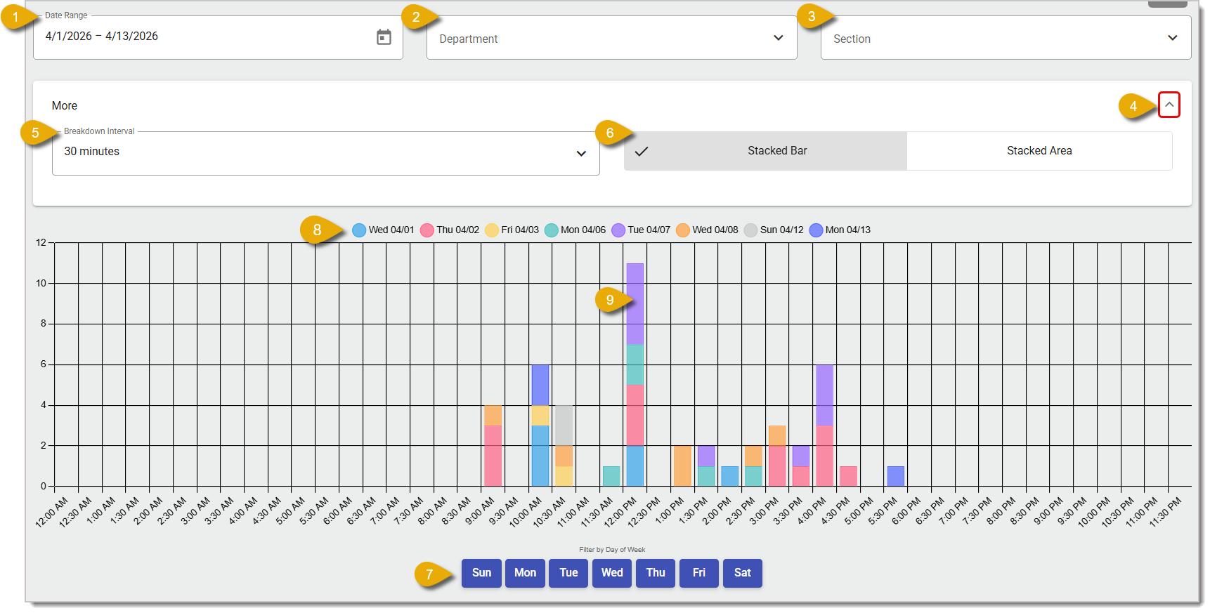
- Date Range — The report will show you only today's sales by default. Change the Date Range of your data by clicking on the Calendar button.
- Department — To view the hourly sales of a certain Department, select one from this drop-list.
- Section — To view the hourly sales of a certain Section, select one from this drop-list.
- More Options — Click on the Chevron on the far right to open a menu where you can change the time breakdown interval of the chart and how the data is displayed.
- Breakdown Interval — Select from the drop-list the time intervals at which in the chart the data is broken down. Options are 15, 30, and 60 minutes.
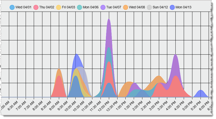
- Data Viewing Options — Click on the Stacked Bar or Stacked Area tab to change how the data is displayed. By default, you will first view the report in Stacked Bar mode, where data will show as bars stacked on each other like in the image above. Stacked Area will show the data as curves stacked on each other, as pictured below.
- Filter Days of the Week — By default, the chart will show data for all days of the week. Click on a day of the week below the chart to exclude its data. Click on the day again to display its data.
- Filter Dates — Each date is color-coded, and you can view what each color represents with the legend above the chart. Click on the circle next to a date to remove it from view. You'll know if a date has been hidden if the date is crossed out, as pictured below.
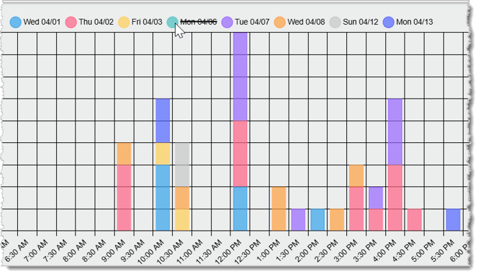
- View Specific Data — Hover your cursor over one of the bars in this graph to view the exact number of sales for the time segment. Note that you can only do this in Stacked Bar view.
Related Articles
Store Sales
Product Sales
Discount Sales
Gift Card Sales
Frequently Asked Questions
Q: I have a question, but I can't find my answer here. How do I get more assistance?
A: If you need immediate assistance, the IT Retail team is available 24/7. Feel free to contact our support team at 877-752-0625. You can also email us at support@marktpos.com, and we will respond within 24 hours.
If you want to offer your customers the option of self-checkout you can do so in the IT Retail syste
You can use the Employees Report to view your top-performing employees and see how their sales compa
Use the Employees page to add new employees, edit existing employee details, and remove employees. I








Is this page helpful?
×Help us improve our articles